 As my section editors have been working on selecting and editing new work for our second issue, I’ve been re-working the look and feel of the magazine.
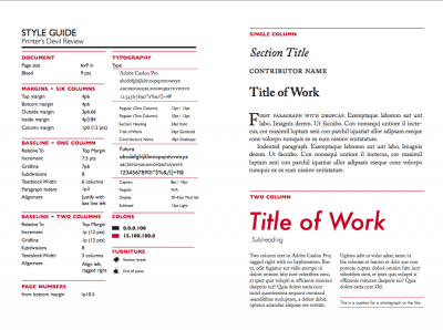
Probably the biggest change is document size: we’re moving from 8 1/2 X 11 inches to 6 X 9 inches, a standard format for literary journals.
Readers will still be able to print pieces from the magazine on letter paper (at a slightly adjusted scale), but will get two facing pages on each sheet. The 6 X 9 format also has a couple of advantages. I can now lay out two-page spreads instead of cramming everything onto a single page, for example; this will be a big help for the arts section, allowing me to accommodate larger images by allowing them to take up more than one page. The format is also the same dimensions as a trade paperback, so if we ever decide to make the magazine available in hardcopy or to print an anthology, everything is already laid out and ready for press.
We’ve also changed our body text font from ITC Galliard (a handsome font used by, among other publications, The New England Review) to Adobe Caslon Pro. The Caslon typeface is the same one used for body text in the New Yorker, and Adobe’s version of Caslon has more flexibility than our old font (true small caps, for example).
We’ve also added a sans serif face to to the mix for captions and occasionally for headers. The magazine is both idealistic (non-commercial, open-access, and focused on emerging writers rather than established names) and forward-looking (embracing mobile technology by offering the content as an ebook). So what better typeface than Futura, a sans serif face based on geometrical shapes, representative of the aesthetics of the Bauhaus school of the 1920s-30s.
In his Elements of Typographic Style, Robert Bringhurst states as his first principle that “typography exists to honor content.” Through our attention to things like picas, points, and proportions, we hope to honor the work of our contributors and enrich the experience of our readers.
